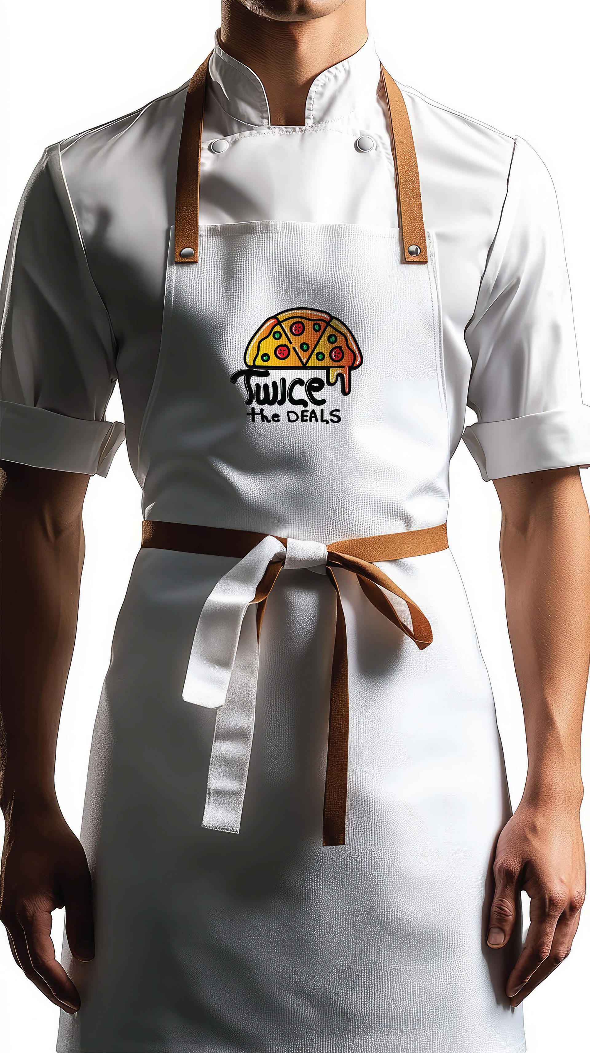
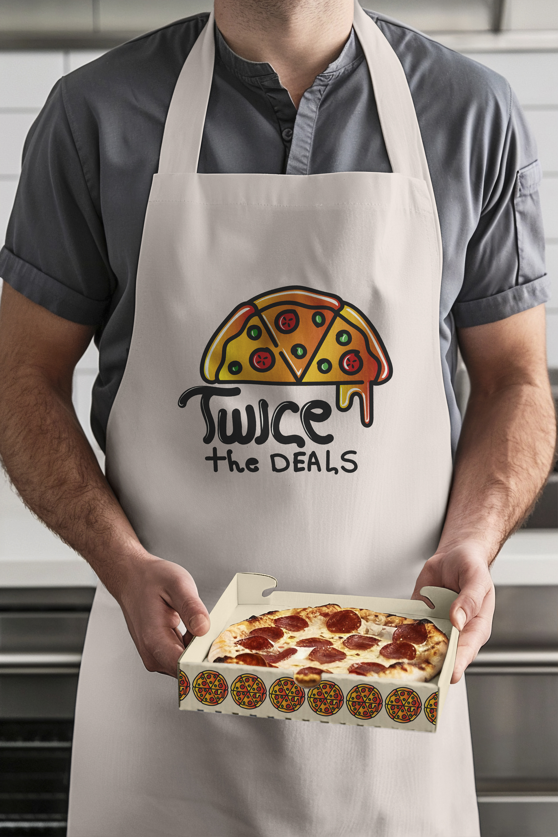
This logo design is one of the most playful and inviting designs we created for “Twice the DEALS,” a pizza restaurant. The goal of this project was to create a fun and casual identity that appeals to a broad audience, emphasizing the value and deliciousness of the restaurant’s offerings. The logo aimed to showcase the restaurant as a welcoming place focused on great deals and quality pizza.
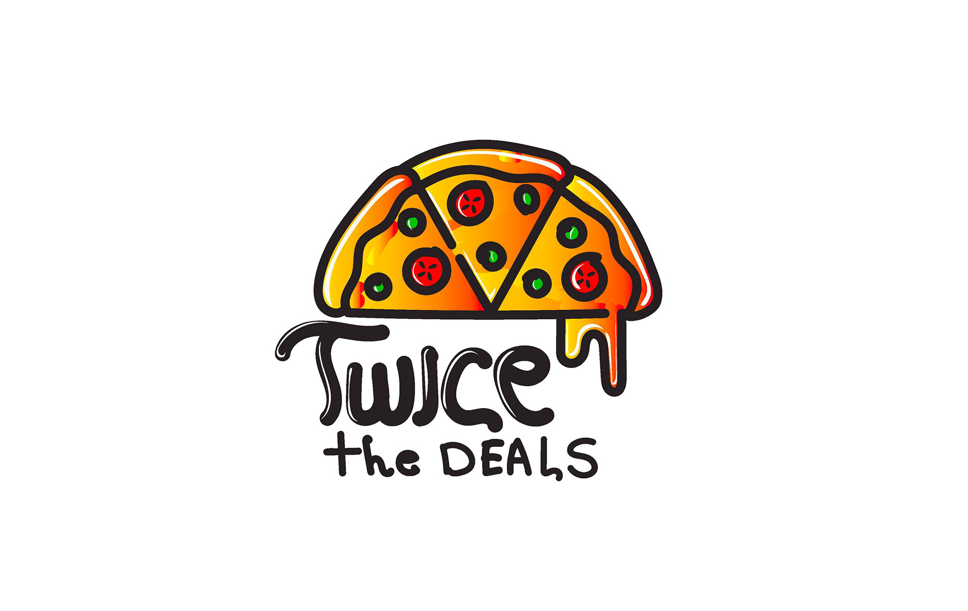
For this project, we focused on crafting a logo that embodies a playful and welcoming personality. To achieve this, we avoided overly polished or corporate design elements. Instead, we incorporated bold, hand-drawn strokes and handwritten typography to create an authentic and casual feel. The centerpiece of the logo—a pizza slice with melting cheese—was designed to symbolize deliciousness and warmth. The text “Twice the DEALS” was handwritten to reinforce the fun and approachable theme, adding a human touch to the design We chose a warm, appetizing color palette of reds, yellows, and oranges to evoke hunger and excitement. The primary challenge was ensuring that the handwritten typography and bold visuals balanced seamlessly to create a cohesive design. Through multiple refinements, we achieved a logo that perfectly represents the brand’s fun and value-driven identity.