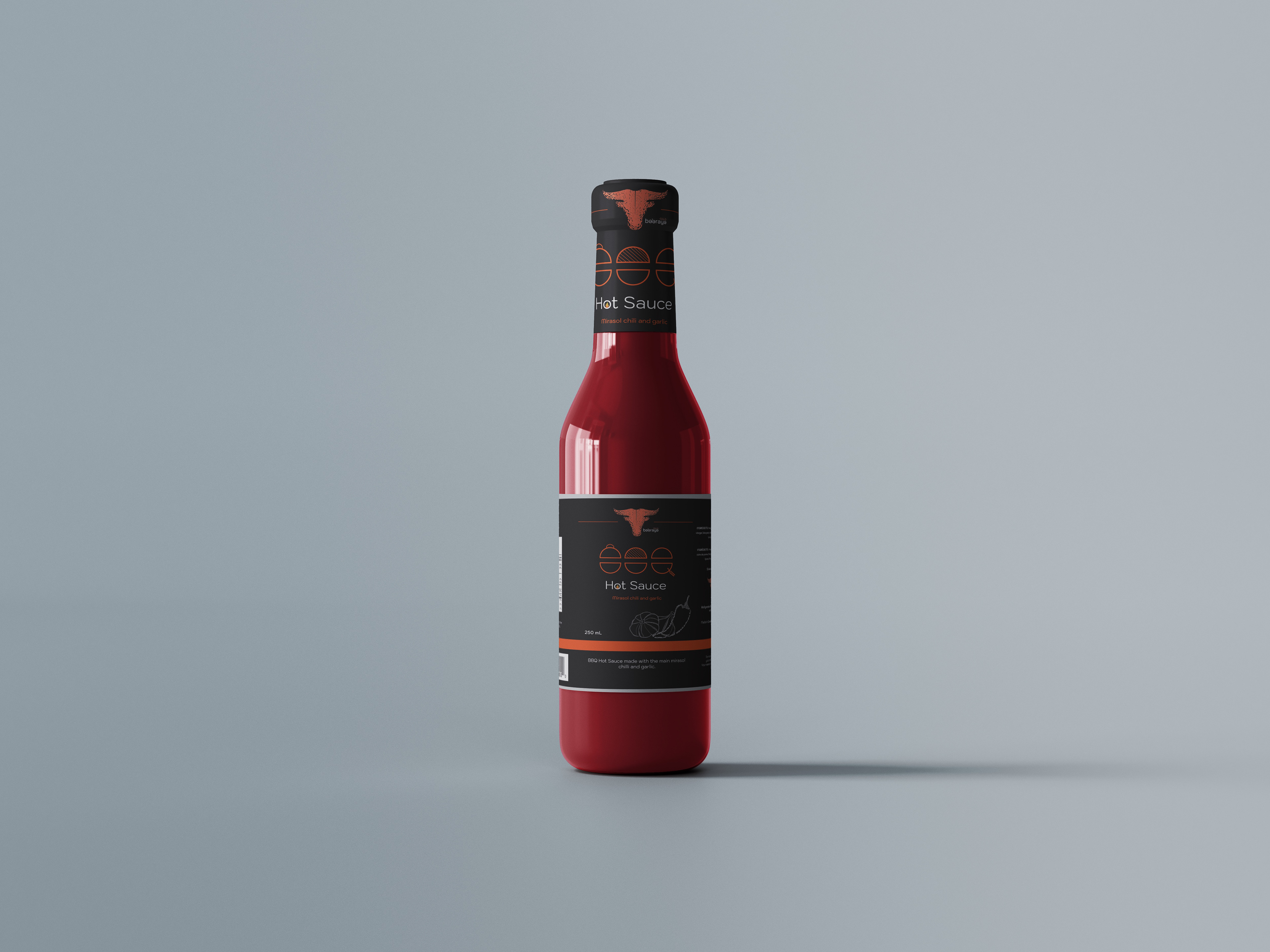
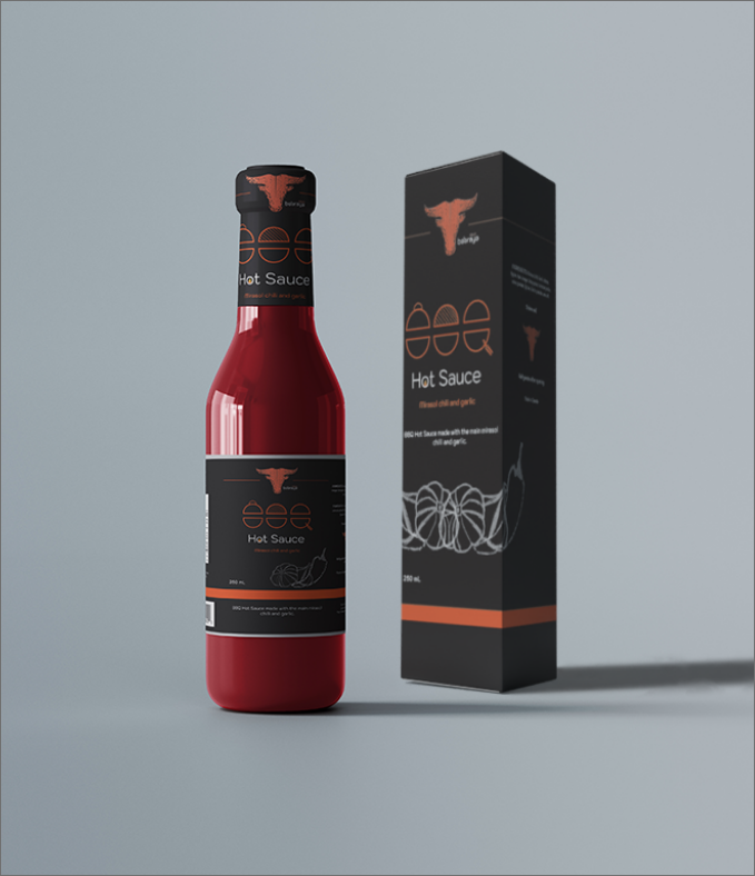
The objective is to develop a distinctive and competitive brand identity for a new BBQ hot sauce. The goal is to ensure the product stands out in a saturated market while capturing the bold and fiery essence of BBQ culture and appealing to the target audience.
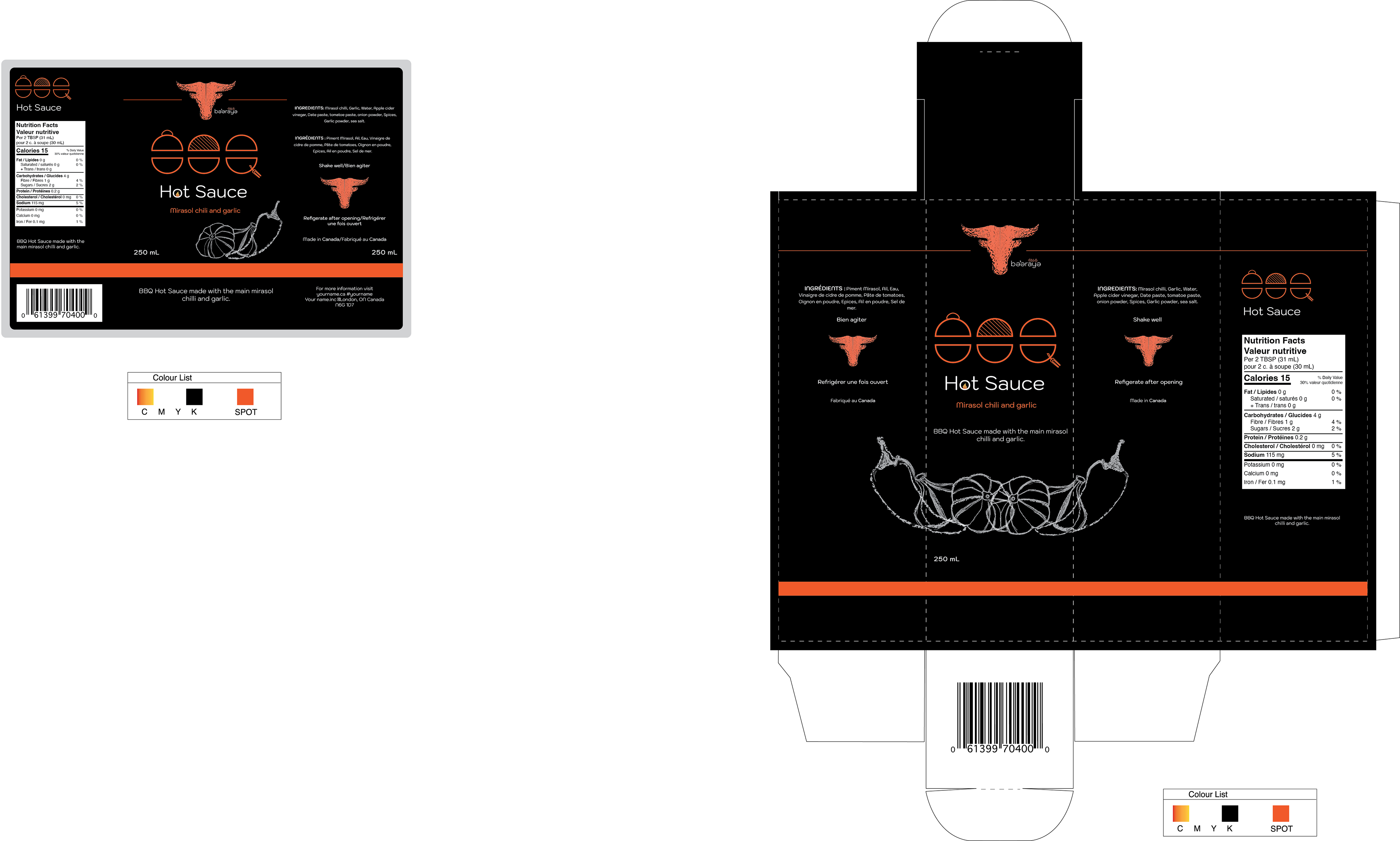
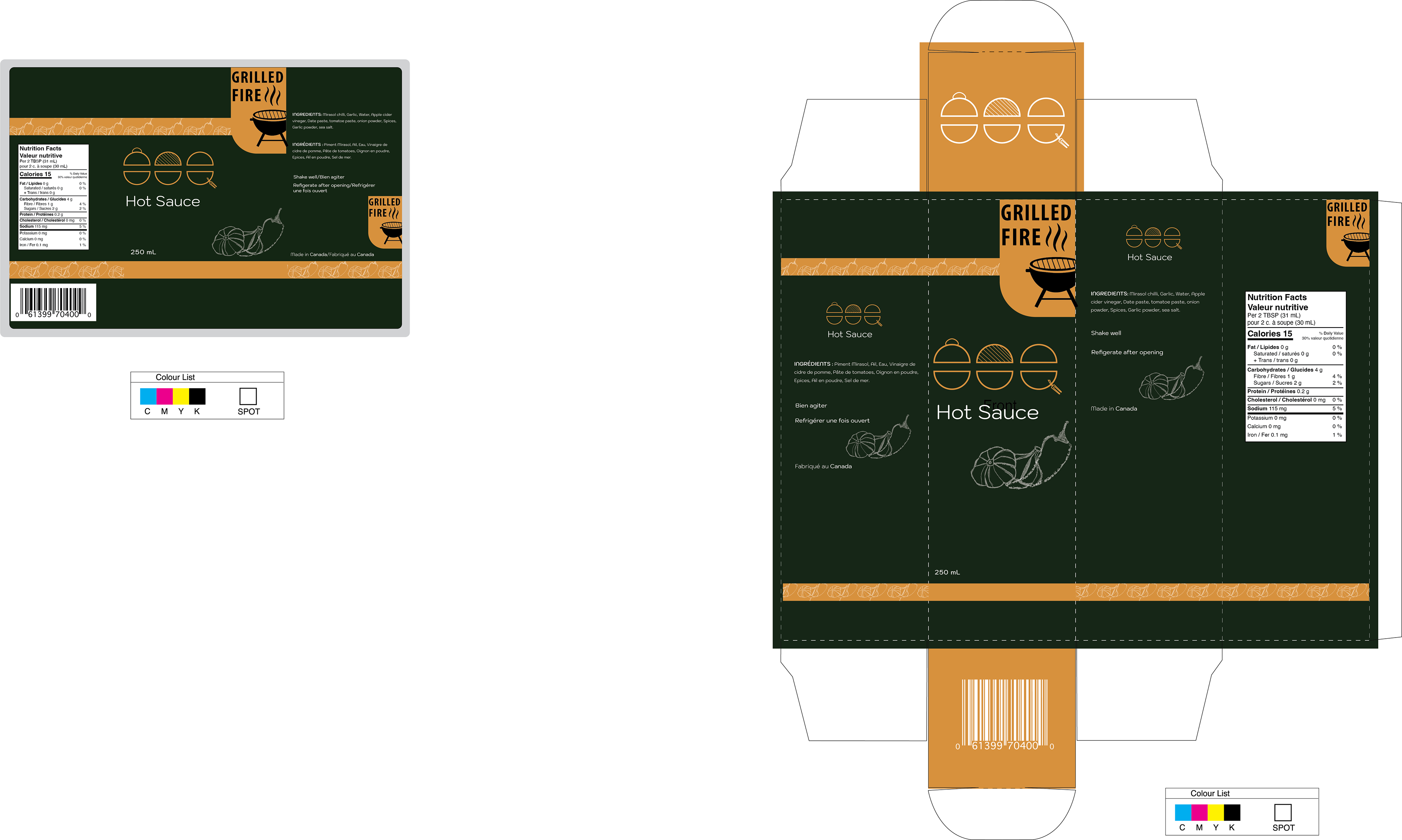
At the start of the project, conducting research proved challenging due to the saturation of common design elements in existing BBQ sauce brands. The task was to integrate these familiar elements into a fresh and distinctive design. To achieve this, we opted for a dark color palette with a single contrasting light color to highlight key elements. This combination ensured the design was eye-catching and aligned with the bold, fiery theme of the product. We created two design variations: one using vibrant, strong colors and another with cooler tones. Ultimately, the dark and strong design was chosen, as it resonated more with the branding vision and the preferences of the target audience.